Sunday, April 17, 2011

Chocolate Drop Mountain, Alaska


Photo by Terry Reed, Alaska

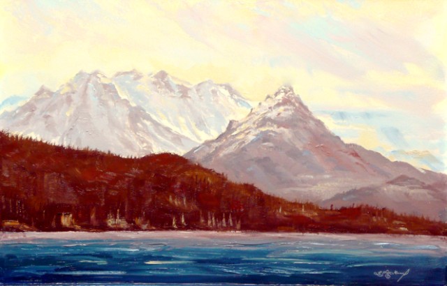
Oil on panel 16 x 24 inches by Len Sodenkamp, Idaho

Last week on Face Book I seen some great photography by Terry Reed, through this amazing communication tool I was able to connect with a fellow artist that otherwise would be unknown to me. She granted me permission to attempt to transmit her digital message onto my panel with brush and oil. The question I often ask myself is why? The image Terry made was more then enough to beautifully address this amazing place. Then why must I paint it; ego perhaps. Did I think I could do better? I believe it is for none of these reasons. When I paint from an image like Terry’s I want to feel that place; be there in my mind and experience that frozen moment in time for myself. I may never stand in that spot breathing in that place but thanks to her work I now have a more profound feeling about its magnificent latitude and longitude.

Intrested persons in Terry Reeds work or my work please feel free to contact me at the following sites 

Love Earth,

Len

Saturday, April 9, 2011

PUSHING THE COLOR

Studio painting south rim Grand Canyon 24 x 48 oil on panel (titled ham and cheese)

Pushing the color,

Last week I was inspired to paint a view taken from around Moab Utah. This week I decided I would remain in the south west and revisit the Grand Canyon. As I scanned through fifty or more images I was drawn to this one. I remember setting up on that cold clear spring morning waiting in the dark for that glorious moment when the sun would crest over the rim. My camera was set ready to capture shots as I fumbled with stiff oil on a glass pallet already forming ice on its edges. A tour bus pulled up and a large group of tourists poured out to snap photos and then off they went. I have posted my photo as well as the study from that morning. I usually don’t title my work but this one I did because I was thinking at the time that looks like a block of cheese and a smoked ham. Maybe I was just hungry? Any way as you can see I really pushed the color envelope.  This is especially obvious when looking at the photo and that’s why I went more with the study pallet. There is a fleeting moment however when these colors are present and you have to seek them out with your minds eye. I find it fitting that this place be rendered using lots of color because it is imposable to capture it with pigment; so I say push the color to make up for it. Also it is obvious that I picked only a tiny section of the image to work on. It is amazing how much information remained and I still felt overwhelmed wile attempting to capture this micro speck of the Grand Canyon.

Happy painting,

Len Sodenkamp

Prints and cards available at the following link www.len-sodenkamp.artistwebsites.com

                                                  8 x 10 plein air oil on panel


Saturday, April 2, 2011

The time question?

Moab Utah, 24 x 48 oil on panel by Len Sodenkamp

The time question?

I get asked the time question a lot, how long did it take you to paint that? My reply varies but usually I respond with its more important for me as an artist to know when a painting is finished then how long it took to paint it. But that’s not what they want to hear so I tell them the truth and usually it’s not what they expect. Some how time has much to do with perceived value. Perhaps this is why many successful painters are dead; they simply ran out of valuable time.

Yesterday as I was straitening up my studio a well dressed middle aged professional looking gentleman stopped in and kindly commented on a painting I had just finished (Moab Utah 24 x 48 oil on panel)

He then asked the time question, four hours I said, including several coffee breaks and a sandwich. He was silent for a moment and asked what does a painting like that cost. $1200.00 at this size and his response was WOW that’s $300.00 per hour I'm an attorney and I don’t make that. I said 45 years to learn what I know; make me an offer! As he began to back peddle I made mention of the forty other paintings pointing to the closet in the corner and I can’t remember how many more I have in storage.

My point being that in a perfect world I would sell every painting every day and be doing what I love. But that’s not how it works, especially these days. I went on to make the statement that I would be elated to sell  thirty or fourty paintings per year but like many artists these days I work a part time job.  I am very grateful that I can work part time because it still allows me quality time every week to paint.  If I couldn’t paint I would just as soon not be breathing. Shocking as that sounds its true and if you put a hundred artists in a room the majority would agree with my statement.

I paint because it’s my oxygen,

So I will continue to breath life into my paintings until my time runs out, sold or not.

Happy painting,

Len Sodenkamp
www.sodenkampart.com and www.len-sodenkamp.artistwebsites.com

Sunday, March 27, 2011

Nocturnes


Nocturne oil on panel 24 x 24 by Len Sodenkamp


One of my favorite painters is Fredrick Remington (1861-1909) his magnificent nocturnes marked an important new direction at the time for the celebrated illustrator, writer, and sculptor of the American vanishing frontier.

I would like to recommend a beautiful book by Nancy K. Anderson with essays by Alexander Nemerov and William C. Sharpe. The book is called THE COLOR OF NIGHT and it is the definitive resource on Remington’s nocturnes. Large reproductions of his stunning paintings are beautifully illustrated including other works not seen publicly since his death. This interesting publication provides inside commentary from  Remington's personal diaries and letters from his contemporary critics of the time.

Happy painting,

Len Sodenkamp


Saturday, March 19, 2011

Shifting gears

Acrylic on panel 24 x 48 by Len Sodenkamp

My Cosmic Light Series paintings www.len-sodenkamp.artistwebsites.com allows me to shift into another painting mode when I feel that lost sense of were to go. I love painting landscapes like my Earth Light Series but it is great to be able to shift gears to an old friend acrylic and it really helps me to stay prolific. The image below is the same acrylic painting as above as seen in the dark. It was over painted with rare earth phosphors in a clear acrylic vehicle. When dry it is invisible but in the dark it glows by emitting light it absorbs and it will stay visible all night. I call these paintings STARSCAPES® FX
LIGHTS ON LIGHT OFF .www.sodenkampart.com

I simply can not or will not become stagnant with my craft. I think it is a bunch of nonsense that artist fear experimenting or changing direction because they were told they wont come across as serious painters. The gallery folks who tell me they cant sell my talent because I am all over the place with my art bore me. I will not change my creative way; it provides me with what I need. Here is a great quote from a great painter Robert Glenn "Art is hard-earned work that is its own reward and has a degree of permanence." I say have fun with it, experiment, compose, get the love out and on the canvas; shift gears by all means because love always comes around full circle.

Happy painting,

Len

Saturday, March 12, 2011

Becoming intimate with each primary color

By removing a primary from the palette the artist is forced to become more intimate with the two remaining primaries. In (example1) above yellow was left off the palette in a effort to better understand Indian red, another of the iron oxide group and to discover its effect on ultramarine and vise versa. Ultramarine was selected because of its warmer hue in the blue family and would then help to warm up the rich but slightly cool Earth toned Indian red. The panel was first toned with pure Indian red and turpentine. It was surprising that it took on a much warmer tone then expected.  The toned passages of the painting built the illusion of an early morning sun rise which was then supported by painting the effect of mist rising off water. It is important to note that the high light and back lit passages of the painting would not be as strong by mixing and applying paint into these areas and so are supported by just the toning. The sun, water fall and reflection elements were made even stronger by removing a small amount of the toning in those pre planed areas before beginning the brush work.  

The image bellow was taken of the painting that was completed on Friday March 11 2011. It was digitally enhanced by introducing a small amount of  yellow spectrum and dramatically illustrates the powerful effect the missing primary has on the painting.
This painting and others in my Earth Light and Reflection Series are available for sale as well as prints, giclee, and cards at http://www.len-sodenkamp.artistwebsites.com/
For information about STARSCAPES® FX night sky murals go to
http://www.sodenkampart.com/ or call Len at 208-484-0792


Sunday, March 6, 2011

Simplified Palette, warm and cool grays on a toned panel


The two illustrations above help to show how to create amazing paintings with very simple palette on a toned panel implementing neutral/natural looking grays. By injecting pure pigment to grater or lesser degrees into those grays along with the introduction of white provides the painter with unlimited possibilities.  I am particularly fond of pigments made from the iron oxide group such as yellow ocher and burnt sienna. Combining these with cobalt blue to create wonderful neutral/natural warm and cool grays. Toning your panel or canvas with pure pigment using paper towel as your brush and a small amount of turpentine lays the foundation for your painting. (See Illustrations above) This simple method also provides the painter with options not available in my opinion by any other means.  My panels are very simple, made from tempered hard board, primed with three coats of any good quality interior/exterior flat white latex paint. You can also use oil based primers as well. I prefer the latex for its fast drying and low odor aspects. Another reason I like the iron oxides family of pigments, they are less expensive and non toxic.

Happy painting,
Len Sodenkamp
http://www.sodenkampart.com/ 
Prints and cards avialible at http://www.len-sodenkamp.artistwebsites.com/