Saturday, November 5, 2011

An alternative art supply source

Here in Boise artists, teachers and crafters are fortunate to have a large independent art supply warehouse. I much prefer to buy art supplies in person rather then on line. Plus there is no waiting or shipping costs. An often overlooked source for many items that artists use can be found at your local building supply business. For instance costly gesso a white primer used on canvases and panels can be replaced with indoor/outdoor flat or semi gloss acrylic latex at a fraction the cost. If you work in oil low odor turpentine found at the paint department is so similar to so called high priced odorless turpentine I can’t imagine why any one wouldn’t switch. Wile your browsing around the paint department I would advise checking out the faux supplies especially those of you who like to work outside the lines and experiment. Faux paints are acrylic based and mix well with artist acrylic and water paints. The pearls and metallics are especially cool and produce amazing results. One last product I would like to share is called water putty. It’s a dry powder when mixed with water hardens to an incredibly hard paintable surface. I like it for building up a paint surface and to create thick and thin areas prior to priming and painting my panels.

The example is oil on panel 41 x 25 which is still underway. The entire mountain was first rendered as a relief using water putty then primed with 4 coats of flat white acrylic latex indoor out door paint.

Oh I forgot 100% of the panel is made from materials bought at the building supply store and no brush was used to apply paint for the mountains just q-tips.

Happy painting,

Len sodenkamp
www.sodenkampart.com

Sunday, October 23, 2011

The best painting I ever did will be the next one I do.

That afternoon I noticed the cloud formations were ideal for a fireworks sunset. I put my gear in the truck and grabbed two large panels. I already knew which one I would use. The place I had in mind would be about a one hour drive. I pulled up on top of the hill and wasted no time in setting up. I tied the easel to the truck so if there was wind my panel wouldn’t become a kite. I began mixing large piles of warm and cool oil on my glass palette because I knew when the time came I would have to apply lots of paint fast. I finished and figured I had about an hour before the real light show would begin. I started building my composition of foreground and middle ground shapes using a large flat brush and quickly punched in the impressions of the landscape as it lay out before me. I knew I needed to keep my values dark because I wanted to capture the light as it would play after the sun went down. But the sky would be my main focus for this painting. As soon as the sun dropped over that ridge I would only have minutes to capture those colors. When the sun started dropping over those worn down mountains I put down the brush and picked up a large palette knife and began mixing and applying lots of paint and the sky began moving across my panel. I brought some of those amazing sky colors down as highlights on to those beautiful ridges and plains below.

I step back a lot to look at the over all painting as it is unfolding and try to pick an area to either leave as it is or add to it. These actions are made consciously it would seem at the time but afterword looking at what minutes before was a blank panel it feels as though something beyond the self is at work. At that moment you become immersed in the present, combined with all you see and so very humbled by creation and your attempt to imply with pigment what Light has already stated before you even had a thought about how you might copy it.

I drove away that evening thinking I had come as close to capturing the essences of a sunset as I ever had. Then I remembered what a friend painter once said.

“The best painting I ever did will be the next one I do”.

Oil on panel plein air 24 x 48 (sold into a private collection 2004) artist: Len Sodenkamp

Monday, October 10, 2011

Food for thought

Plein air oil on framed panel 24 x 40 inches by Len Sodenkamp

The top image is a plein air study from a few weeks ago wile on location in the Saw Tooth Mountains of Idaho. Deeply influenced by my surrounding on a beautiful warm fall afternoon I was impressed to paint all that was before me. It was like a cornucopia of delicious foods and I wanted to eat every thing in sight. I thought by subordinating the foreground it might allow the viewer to move more easily into those amazing light filled peaks off in the distance. Was I successful?


The bottom image is a crop taken from the same painting removing the foreground information. Simplification of subject mater especially when painting plein air can sometimes produce powerful impressions. My point being; which painting makes the strongest statement?
Knowing how much information to depict and when to stop painting is always a big?

Happy painting,

Len Sodenkamp

Saturday, October 1, 2011

Fall colors in mid day light

Fall color in mid day light,

For years I practiced not using color straight from the tube; that is to say no white or neutralizing. Needless to say you can find your self in unfamiliar territory using full strength pigment especially with a limited primary palette. Taking the path less traveled invites the possibility of becoming lost. Most of us can recall the feeling of being lost and how humbling it is. Life teaches us to avoid unpleasantness and to stay in our safe zone. So should one not stand metaphorically on the last rung of the ladder and reach out for once thought unreachable fruit?

Fall color in mid day light was painted on location 9-27-11 at Fisher Creek Saw Tooth Mountains of Idaho. Palette: cobalt blue, cad red, cad yellow light and medium.

Oil on framed panel 24 x 24 inches plein air (fall color in mid day light) by Len Sodenkamp www.sodenkampart.com

Sunday, September 18, 2011

The Saw Tooth Mountains of Idaho

Visiting an old friend,

The Saw Tooth Mountains live up to their name sake and of all the mountain ranges I have gazed upon these are among my favorites. To make it even better they are only a wonderful three hours scenic drive from our front door.

The painting below was done in 2005 from a place we try to visit at least once a year. Like an old friend this particular view is waiting to pose another spectacular fall sun rise or sun set. I can recall painting from this spot at least a dozen times in the last 6 years and never tire of painting it again and again. Saw Tooth Sun Rise was acquired by close friends of our family; Idaho born folks who grew up playing in the amazing Stanley Basin wonderland.

The little western town of Stanley Idaho is nestled at the base of the majestic Saw Tooth’s on the beautiful pristine Salmon River. Log cabins are available with decks overlooking the water and my wife Elaine made our reservations. We are both looking forward to time away from the city and a peaceful respite. I plan to paint every day and she will keep me company wile catching up on some reading. The air will be crisp with fall colors and we do love aspens this time of year. I sound like a travel brochure but in defense of my ramblings one must be there to appreciate how modern times have not spoiled this wonderful place.

Happy fall,

Peace to you all,

Len Sodenkamp
www.sodenkampart.com


Oil on framed panel (Saw Tooth Sun Rise) 52 inches x 16 inches by artist Len Sodenkamp (sold)

Friday, September 2, 2011

Ten Years Ago Idaho

1966 at age eighteen just out of high school I made a bold move to beautiful but often soggy Seattle. Twenty one years later I was very happy to be living in shall I say somewhat dryer Idaho? Another twenty three years swiftly passed and today my love of painting Idaho can be found hanging on more then a few walls. I decided to take a nostalgic look back ten years and so selected this panoramic landscape of a spring morning painted in 2001. It typifies the volcanic formations of an amazing area appropriately named; The Magic Valley. In this region of Idaho the meandering Snake River flows through deep wide canyons and lush valleys. I often use the long narrow format because it helps accentuate vastness. From this vantage point a viewer might get the impression of looking at a desolate deserted land. Perhaps our best kept secrete.

I do find it helpful to look back at my older works as it provides insight for the creative journey forward. At times when feeling unmotivated a little reminiscing can be just the thing to rekindle a creative spark.

Happy reminiscing,

Len Sodenkamp
www.sodenkampart.com


Acrylic on panel 48 inches x 12 inches by Len Sodenkamp
(part of the artist’s private collection)


Sunday, August 28, 2011

Summer Light at Night

Summer Light at Night,

Some might say this reminds me of the black light stuff from the seventies; call me an old hippie, I loved it then and still do. Andy’s soup can paintings blew us away and reminded artists of the day that art is bought for many reasons including chicken noodle soup. www.artbrokerage.com/artist/Andy-Warhol
Mr. Warhol would no doubt shudder at my comparison but perhaps Vincent www.vangoghgallery.com might have approved the use of rare earth phosphorus had he come across it. Starry Night speaks volumes about how night light intrigued Van Gogh and no doubt invaded his dreams.

Phosphorus can be extended into both acrylic and oil vehicles to produce dramatic effects when different types of lights or the lack there of are introduced. When painting with phosphorus; light in a manor of speaking becomes fluid on the palette. Working in a dark room environment the artist is actually painting in the dark. Each artist will of course take creative license as to how this process will unfold for them and as artists we must intuitively know that what we paint is LIGHT. Speaking purely for my self I readily seize every opportunity to explore LIGHT from any and all possible perspectives least of all light at night.

Happy night painting,

Len Sodenkamp
www.sodenkampart.com

Summer Light at Night 24 x 30 inches acrylic and phosphorus on box panel Lights On-Lights Off Series by Len Sodenkamp
As viewed in the dark with lights off and the introduction of a small amount of diffused black light.

Saturday, August 20, 2011

Night Flowers

Night Flowers,

Some times I paint the same way I cook, what ever is in the fridge goes in the pot. A stew can be a wonderful meal of acquired ingredients all mixed together in a great tasting sauce. Pulling out old painting techniques and combining materials with dust on their lids can taste wonderful to the soul. Revisiting the first time you tried this or that stimulates warm creative feelings. It’s a lot like the feeling of bumping into an old friend and realizing how much you missed them.

I tend to paint in series of works or variations on a theme; so looking back five years I see strong interesting elements no longer being used in my current work. This is unfortunate because those dormant techniques could perhaps work very well in my next painting.

Yesterday I ran into several old friends and had great time painting Night Flowers.

Happy reunion painting,

Len Sodenkamp
www.sodenkampart.com
Acrylic on box panel 12 x 21 inches by Len Sodenkamp

Sunday, August 14, 2011

Night paintings

What does color look like at night? There can be no better resource on the topic of night color then Frederic Remington. Many are not aware of his work in the area of night painting. I found a wonderful assemblage of Fred Remington’s night paintings in a book called :( The Color of Night) by Nancy K. Anderson, with essays by Alexander Nemerov and William C. Sharpe; in my opinion a most amazing addition to any art resource library.

Who doesn’t love moon light, especially a perfect full moon breaking over a high mountain ridge. Then top it off with fast moving clouds propelled by a cool summer breeze across a breath taking pristine alpine lake.

Night painting or painting concepts of what a particular composition might look like at night is a fascinating exploration of color and light.

Happy night painting,

Len Sodenkamp
Links to my original art as well as fine art prints go to www.sodenkampart.com
Oil on box panel 20 x 30 inches by Len Sodenkamp

Thursday, August 11, 2011

Summers Light


Well the days are getting shorter and even though it’s a beautiful summer here in Idaho the season change is on the horizon. From the garden ideas spin as life flows from my watering wand and the plants respond with amazing work. An impression is born recalling planting those tiny seeds.

This painting began several weeks ago just debating on what medium to use. Oil dominates my pallet and found it interesting that I was leaning toward acrylic. Admittedly conventional acrylics were not at work but rather a combination of products I have become familiar with over the years. The subject is so three dimensional it seamed fun to build shapes from the surface to achieve a more 3-D effect. The relief flora shapes would also help to place interesting light and shadow.

This work was just completed and represents the forth of its kind. Certainly a departure from my plein air or studio work but then some times it’s just fun to depart into Summers Light.

Happy summer painting,

Len Sodenkamp
www.sodenkampart.com artist Len Sodenkamp 24.5 x 31.5 mixed media

Sunday, July 31, 2011

From the Garden

Tending the garden during the hot days of July and August can get a bit overwhelming at times. The commitment to take care of what you have sown is not unlike caring of a dog or cat. We plant vegetables inter mixed with flowers and feast on fresh picked goodies wile also enjoying the lush greenery they provide.

This small 12 x 16 inch oil on panel was painted plein air taking ideas from my surroundings and building a composition. Wile it is of no particular place it must represent many places throughout my life I have seen. Perhaps even the Yellow Brick Road or in this case the sand stone path.

The making of this art took about one hour working wet into wet oil on a 12 x 16 panel. I used one 3/4 inch flat brush and a medium sized pallet knife. Using just the three primaries and white I squeeze out lots of paint on a large glass pallet and begin by mixing piles of warm and cool colors. When painting plein air the light is always changing so you need to put the paint on and leave it alone. I can’t tell you how many paintings I have destroyed in the last five minutes only to realize what I had done to an otherwise nice work. Plein air is not like studio work; it takes determination to set up out side in the elements and attempt to paint the natural world. As frustrating as it can be at first I highly recommend getting out of the studio and painting in the outdoors. It will challenge you.

Happy summer painting

Sunday, July 24, 2011

The Colors of a Summer Garden

The colors of a summer garden takes me back to my childhood growing up with parents who loved their yard and gardens. My mother always planted colorful boarder flowers along the walkway edges and in beds circling the giant box elder trees. Caught up in this addictive activity at a very young age I could be seen pushing the old one kid powered lawn mower. The expectation of 25 cents was my motive but the real reward was how beautiful the summer yard always looked.

My painting is called: That Summer Day. The effort was to depict the creative work that goes into such a planed spring planting. Attempting to duplicate such a botanical feast with oil paint in this artist’s opinion could only come close by pushing the color envelope. It is oil on panel 36 inch x 24 inch painted on location plein air. By working fast, wet into wet; with lots of paint mixed on a large glass palette, a one inch wide flat brush and palette knife; I believe I may have caught a glimpse of That Summer Day.


Sunday, July 17, 2011

Owyhee Picture Jasper

Last week I took a few days off from work and home chores. Not having seized the opportunity to paint plein air for way to long I loaded the truck with provisions and took off. I met up with my friends Jed and Von. Their home is located 50 feet from the Snake River just across the Idaho border in Oregon. The next day Jed and I took off on an old dirt road heading toward the Owyhee River. I took over 150 images that day. We ended up in the most amazing spot on the shore of the Owyhee Reservoir. The waters are situated deep in the canyons volcanic formations and are a sight to behold. That evening we ate a great meal cooked on my dad’s old camp stove and waited for the evening colors to fall upon us. We turned in just as the almost full moon came over the ridge. The next morning as the sun crested the ridge tops I began to paint. The colors seamed to flow effortlessly from my pallet to my panel. Then I saw it! There is a gem stone found in the region know as Owyhee Picture Jasper and my pallet was looking curiously like this beautiful gem stone. Just like that precious gem this memory has become a precious gem. This painting will always fill my heart with memories of this beautiful place shared with a good friend.

Thanks Jed,

Saturday, May 21, 2011

Light, Silhouette and Sight

Silhouette would not be known without light. Because of light everything seen is in silhouette. Of course nether would exist in our human consciousness without out sight. The universe is abundant with light and it is also vastly very full of dark. Specks of light will always penetrate unobstructed darkness; however all the darkness of space could not penetrate those same specks of light. Interesting that every thing we see is some form of matter silhouetted in light.  Trees, mountains, lakes, clouds, or a distant star are all visible because light puts them in silhouette. At night those specks of light we call stars become visible in the absence of our suns light then silhouetted by the surrounding darkness of space. 

Creation displays amazing beauty with light, the painter is limited to brush and pigment. It is at best a feeble attempt; never the less the obsession continues.

Be in the Light,

Len Sodenkamp

Original paintings, prints and cards of my Earth Light Series are available at:
http://www.len-sodenkamp.artistwebsites.com/


 Oil on panel called (Be in the Light) 24 inches x 48 inches by Len Sodenkamp

Sunday, May 15, 2011

The panorama composition

The panorama composition has long been a favorite. Both horizontal and vertical panels are common in my studio. It lends itself to the vast expanses of sky and mountain shapes that dominate the Pacific North West I call home. The long and narrow is often considered a contemporary look in the art and design world. I just find it the only way to capture what I am trying to say.

The painting below is oil on panel 13 inches x 42 inches depicting  a day break on top of the Trinity Mountains. I snuggled down in my sleeping bag on that cool summer morning and watched in aw as nature provided the light show of a life time. The water droplets were of uniform size with just the right clouds in just the right relationship to the sun producing colors by way of an incandescent reaction.

Needless to say once in a life time if you’re lucky, don’t forget to take your camera to bed with you.

Len Sodenkamp
Original art, prints and cards available at www.len-sodenkamp.artistwebsites.com

Sunday, May 8, 2011

Miniatures

These miniatures are oil on panel, each 4 inches x 6 inches. A variation on a theme using a limited palette of Indian red, yellow ocher, cobalt blue and white to tell the story. Each 4 inch x 6 inch study was completed in 30 to 45 minutes. The original grouping contained six miniatures on a special panel of my own design.
(See below) 

I was taught this practice by several great mentors over the years and had forgotten how fun it is.

Happy painting,

Len Sodenkamp
http://www.len-sodenkamp.artistwebsites.com/

Tuesday, April 26, 2011

Painting in pairs


Last week at the studio I decided to have some fun and just attack the panel with rich expressive colors. I found myself thinking about my favorite elements....... mountains, water, and a fast moving sky. The top image was actually my favorite and happened to be the second one of the pair, the bottom being the first painting of the pair. I didn’t necessarily plan to paint a pair that day but the first painting just seamed to explode onto my panel and still having ample time and plenty of paint on the palette I went for the second one. I find most often that the second painting not only happens even faster then the first but displays a more expressive quality. Hard to put into words but it’s like some one else was painting and I was just observing. Strange as that sounds, it best describes how I feel about it especially now sitting here typing out this blog. So my reason for this blog is to share ideas with anyone reading not just other painters but anyone involved with the creative process. In a world with such seemingly difficult stresses let us not forget the importance of the creative mind. We mustn’t get so self absorbed in how much a gallon of gas costs that we forget who we are. We are all part of the creative mind and as such it is our birth right to create from our thoughts to see and express each in our own way what a beautiful place the world is.

Happy creating,

Len Sodenkamp
Original art, art prints and cards at www.len-sodenkamp.artistwebsites.com

Sunday, April 17, 2011

Chocolate Drop Mountain, Alaska


Photo by Terry Reed, Alaska

Oil on panel 16 x 24 inches by Len Sodenkamp, Idaho

Last week on Face Book I seen some great photography by Terry Reed, through this amazing communication tool I was able to connect with a fellow artist that otherwise would be unknown to me. She granted me permission to attempt to transmit her digital message onto my panel with brush and oil. The question I often ask myself is why? The image Terry made was more then enough to beautifully address this amazing place. Then why must I paint it; ego perhaps. Did I think I could do better? I believe it is for none of these reasons. When I paint from an image like Terry’s I want to feel that place; be there in my mind and experience that frozen moment in time for myself. I may never stand in that spot breathing in that place but thanks to her work I now have a more profound feeling about its magnificent latitude and longitude.

Intrested persons in Terry Reeds work or my work please feel free to contact me at the following sites 

Love Earth,

Len

Saturday, April 9, 2011

PUSHING THE COLOR

Studio painting south rim Grand Canyon 24 x 48 oil on panel (titled ham and cheese)

Pushing the color,

Last week I was inspired to paint a view taken from around Moab Utah. This week I decided I would remain in the south west and revisit the Grand Canyon. As I scanned through fifty or more images I was drawn to this one. I remember setting up on that cold clear spring morning waiting in the dark for that glorious moment when the sun would crest over the rim. My camera was set ready to capture shots as I fumbled with stiff oil on a glass pallet already forming ice on its edges. A tour bus pulled up and a large group of tourists poured out to snap photos and then off they went. I have posted my photo as well as the study from that morning. I usually don’t title my work but this one I did because I was thinking at the time that looks like a block of cheese and a smoked ham. Maybe I was just hungry? Any way as you can see I really pushed the color envelope.  This is especially obvious when looking at the photo and that’s why I went more with the study pallet. There is a fleeting moment however when these colors are present and you have to seek them out with your minds eye. I find it fitting that this place be rendered using lots of color because it is imposable to capture it with pigment; so I say push the color to make up for it. Also it is obvious that I picked only a tiny section of the image to work on. It is amazing how much information remained and I still felt overwhelmed wile attempting to capture this micro speck of the Grand Canyon.

Happy painting,

Len Sodenkamp

Prints and cards available at the following link www.len-sodenkamp.artistwebsites.com

                                                  8 x 10 plein air oil on panel


Saturday, April 2, 2011

The time question?

Moab Utah, 24 x 48 oil on panel by Len Sodenkamp

The time question?

I get asked the time question a lot, how long did it take you to paint that? My reply varies but usually I respond with its more important for me as an artist to know when a painting is finished then how long it took to paint it. But that’s not what they want to hear so I tell them the truth and usually it’s not what they expect. Some how time has much to do with perceived value. Perhaps this is why many successful painters are dead; they simply ran out of valuable time.

Yesterday as I was straitening up my studio a well dressed middle aged professional looking gentleman stopped in and kindly commented on a painting I had just finished (Moab Utah 24 x 48 oil on panel)

He then asked the time question, four hours I said, including several coffee breaks and a sandwich. He was silent for a moment and asked what does a painting like that cost. $1200.00 at this size and his response was WOW that’s $300.00 per hour I'm an attorney and I don’t make that. I said 45 years to learn what I know; make me an offer! As he began to back peddle I made mention of the forty other paintings pointing to the closet in the corner and I can’t remember how many more I have in storage.

My point being that in a perfect world I would sell every painting every day and be doing what I love. But that’s not how it works, especially these days. I went on to make the statement that I would be elated to sell  thirty or fourty paintings per year but like many artists these days I work a part time job.  I am very grateful that I can work part time because it still allows me quality time every week to paint.  If I couldn’t paint I would just as soon not be breathing. Shocking as that sounds its true and if you put a hundred artists in a room the majority would agree with my statement.

I paint because it’s my oxygen,

So I will continue to breath life into my paintings until my time runs out, sold or not.

Happy painting,

Len Sodenkamp
www.sodenkampart.com and www.len-sodenkamp.artistwebsites.com

Sunday, March 27, 2011

Nocturnes


Nocturne oil on panel 24 x 24 by Len Sodenkamp


One of my favorite painters is Fredrick Remington (1861-1909) his magnificent nocturnes marked an important new direction at the time for the celebrated illustrator, writer, and sculptor of the American vanishing frontier.

I would like to recommend a beautiful book by Nancy K. Anderson with essays by Alexander Nemerov and William C. Sharpe. The book is called THE COLOR OF NIGHT and it is the definitive resource on Remington’s nocturnes. Large reproductions of his stunning paintings are beautifully illustrated including other works not seen publicly since his death. This interesting publication provides inside commentary from  Remington's personal diaries and letters from his contemporary critics of the time.

Happy painting,

Len Sodenkamp


Saturday, March 19, 2011

Shifting gears

Acrylic on panel 24 x 48 by Len Sodenkamp

My Cosmic Light Series paintings www.len-sodenkamp.artistwebsites.com allows me to shift into another painting mode when I feel that lost sense of were to go. I love painting landscapes like my Earth Light Series but it is great to be able to shift gears to an old friend acrylic and it really helps me to stay prolific. The image below is the same acrylic painting as above as seen in the dark. It was over painted with rare earth phosphors in a clear acrylic vehicle. When dry it is invisible but in the dark it glows by emitting light it absorbs and it will stay visible all night. I call these paintings STARSCAPES® FX
LIGHTS ON LIGHT OFF .www.sodenkampart.com

I simply can not or will not become stagnant with my craft. I think it is a bunch of nonsense that artist fear experimenting or changing direction because they were told they wont come across as serious painters. The gallery folks who tell me they cant sell my talent because I am all over the place with my art bore me. I will not change my creative way; it provides me with what I need. Here is a great quote from a great painter Robert Glenn "Art is hard-earned work that is its own reward and has a degree of permanence." I say have fun with it, experiment, compose, get the love out and on the canvas; shift gears by all means because love always comes around full circle.

Happy painting,

Len

Saturday, March 12, 2011

Becoming intimate with each primary color

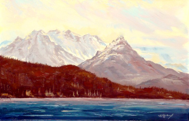
By removing a primary from the palette the artist is forced to become more intimate with the two remaining primaries. In (example1) above yellow was left off the palette in a effort to better understand Indian red, another of the iron oxide group and to discover its effect on ultramarine and vise versa. Ultramarine was selected because of its warmer hue in the blue family and would then help to warm up the rich but slightly cool Earth toned Indian red. The panel was first toned with pure Indian red and turpentine. It was surprising that it took on a much warmer tone then expected.  The toned passages of the painting built the illusion of an early morning sun rise which was then supported by painting the effect of mist rising off water. It is important to note that the high light and back lit passages of the painting would not be as strong by mixing and applying paint into these areas and so are supported by just the toning. The sun, water fall and reflection elements were made even stronger by removing a small amount of the toning in those pre planed areas before beginning the brush work.  

The image bellow was taken of the painting that was completed on Friday March 11 2011. It was digitally enhanced by introducing a small amount of  yellow spectrum and dramatically illustrates the powerful effect the missing primary has on the painting.
This painting and others in my Earth Light and Reflection Series are available for sale as well as prints, giclee, and cards at http://www.len-sodenkamp.artistwebsites.com/
For information about STARSCAPES® FX night sky murals go to
http://www.sodenkampart.com/ or call Len at 208-484-0792


Sunday, March 6, 2011

Simplified Palette, warm and cool grays on a toned panel


The two illustrations above help to show how to create amazing paintings with very simple palette on a toned panel implementing neutral/natural looking grays. By injecting pure pigment to grater or lesser degrees into those grays along with the introduction of white provides the painter with unlimited possibilities.  I am particularly fond of pigments made from the iron oxide group such as yellow ocher and burnt sienna. Combining these with cobalt blue to create wonderful neutral/natural warm and cool grays. Toning your panel or canvas with pure pigment using paper towel as your brush and a small amount of turpentine lays the foundation for your painting. (See Illustrations above) This simple method also provides the painter with options not available in my opinion by any other means.  My panels are very simple, made from tempered hard board, primed with three coats of any good quality interior/exterior flat white latex paint. You can also use oil based primers as well. I prefer the latex for its fast drying and low odor aspects. Another reason I like the iron oxides family of pigments, they are less expensive and non toxic.

Happy painting,
Len Sodenkamp
http://www.sodenkampart.com/ 
Prints and cards avialible at http://www.len-sodenkamp.artistwebsites.com/ 

Saturday, February 26, 2011

Painting impresions wet into wet with oil


Shoshone Falls Snake River Plateaus Idaho oil on panel 24 x 49 inches

Painting oil in an impressionistic style is painting on fast forward. Things happen so fast you have to recognize those single brush strokes that jump off the canvas. Then the trick is to leave those areas undisturbed. It took me years and many overworked never to be seen paintings to learn that. I hope in some small way my illustration 1 thru 6 above helps to depict this process. I'll spend more time building a frame then it took me to paint it.


Thursday, February 24, 2011

Murals and paintings that you can see in the dark

The images below I call Cosmic Light Series lights on lights off  Some of my murals cover entire walls and ceilings. Many of my murals are available in fine art prints, giclee canvases and greeting cards at this fine art site.


A naturally occurring rare earth mineral combined in a clear medium was painted over each mural or painting which allows them to become dramatically visible in the dark. Digital images do not do justice to how amazingly beautiful a Cosmic Light mural is in real life. Try to imagine one on your bedroom ceiling or wall. Some clients prefer murals that are only visible in the dark. During the day or when lights are on this type of mural is totally invisible. As a licensed STARSCAPES® FX artist I have exclusive access to this amazing patented formula. The glow in the dark aspect of these works will stay visible all night. It is safe and non-toxic and becomes activated by natural or artificial means. It responds to black light favorably and takes on a very romantic mood.

To learn more about STARSCAPES® FX go to my web site http://www.sodenkampart.com/   and click on STARSCAPES® in the menu bar. Call Len at 208-484-0792 

Please feel free to ask questions and your comments will be greatly appreciated. 


Saturday, February 19, 2011

                        Goldilocks is 36 x 46 inches oil on panel by artist Len Sodenkamp

Prints, giclees and greeting cards are now available for this and other Space art Cosmic Light productions at the following site http://www.len-sodenkamp.artistwebsites.com/ click galleries then click Space Art Cosmic Light Series


In Idaho you can view my original paintings  at the Gaia Gallery and Studio in Eagle Idaho at
237 North First Street
call ahead for an appointment at 208-871-8781 Owner Kelly Beach

This painting puts you right in the Goldilocks Zone. New findings lead scientists to understand that Earth like planets are more popular then thought in the cosmos. My composition provides the viewer with exciting light and color combined with interesting shapes and patterns. It is nice to the leave Earth to paint other worlds. Not that I would ever tire of painting the Earth. Being Inspired by the amazing movie Avatar and the extraordinary artwork used to depict the planet Pandora well that was a breathtaking experience for me as an artist. What a trip it must have been to be on that team of Creative Minds.

Please feel free to comment and ask questions about this or any of my Space Art Cosmic Light Paintings as well as my Earth light Series, Plein air Series, Lights on Series, and Cosmic Dance Series.


Sunday, February 13, 2011

The Creative Mind


The painting above is oil on panel 24 x 24 inches. To see more in my Earth Light Series

For several months I have been painting with out the use of visual aids. There are times when visual information is required but to just let the painting flow out of you on to a blank white surface well that’s exhilarating.